This summer we are pleased to share research highlights from our Spatial Data Science Summer Fellows, showcasing their work on the US COVID Atlas and opioid risk environment research projects.
This week, Summer Institute in Social Research Methods (SISRM) Fellows Margot Bolanos-Gamez (BS and BA ‘23) and Ziqian (Alexa) Jin (BA ‘24) share an update on their work in developing an interactive web map for HeRoP’s Opioid Risk Environments research.
As Summer Institute in Social Research Methods (SISRM) Fellows with the Healthy Regions + Policies Lab, we are working exclusively with the Opioid Environment Policy Scan (OEPS), a free, open-source database characterizing the multi-dimensional risk environment surrounding opioid use in U.S. justice populations. The OEPS was developed for the Justice Community Opioid Innovation Network (JCOIN), an NIH HEAL Initiative and multi-year federally funded project for which the University of Chicago serves as the Methodology and Advanced Analytics Resource Center (MAARC). As part of our summer fellowship, we are working virtually and collaboratively to develop an interactive web map for the OEPS using WebGeoDa, a set of tools and scaffolding for developing geospatial data dashboards. The OEPS web map is still under construction, but we are proud to highlight our progress thus far.
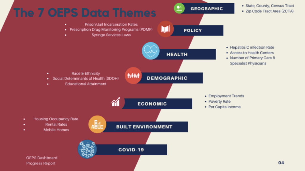
The OEPS database consists of more than four dozen datasets that are grouped into seven distinct themes: Geographic Boundaries, Policy, Health, Demographic, Economic, Physical Environment, and COVID-19. Most of the variables in the OEPS are available at multiple spatial scales including state, county, Census tract, and zip code levels. The OEPS Web Map will visualize data to allow users to explore the database, including policy and health variables such as prison incarceration rates, access to health centers, and alcohol outlet density. Ultimately, this map will be useful for researchers, analysts, and any database user interested in quickly exploring the data or uncovering spatial patterns.

The current development of this visualization requires an understanding and application of GitHub, JavaScript, and Web Geoda scaffolding. The cleaned and merged metadata used for the visualizations is sourced from the public GitHub repository as either CSV files or shapefiles (see Geographic Boundaries files). The programs in use include GitHub for code collaboration, Visual Studio Code for code construction, and WebGeoDa for preliminary live map visualizations.

Due to the unique characteristics of each dataset and their multivariate formats, one key aspect in developing a user-friendly, interactive map is to make sure that data are represented appropriately to their scale and subject matter. To do this, we have been researching the ideal data classification method (either quantile, natural breaks, or equal intervals, and the number of data bins used for each) as well as the most appropriate color hues for each variable.
While we are each responsible for integrating individual datasets with the live map structure from WebGeoDa, we have also provided feedback on one another’s progress. For example, some datasets have “null” or “NaN” values – indicating that data was missing or not available. For the Hepatitis C prevalence rate variable shown in the map below, several states, including Arizona, reported “NaN” at the state level, meaning they did not report a statistic. However, “NaN” does not mean “0”, as 0 indicates a value, or data present, whereas “NaN” indicates a lack of data. We were able to catch this discrepancy early on, avoiding the mistake of representing what is actually missing data as a real infection rate of 0%.

Through working closely with our HeRoP Lab research advisors, Dr. Qinyun Lin and Dylan Halpern, we have thus far added more than 30 variables across three themes at multiple spatial scales to the web map. We have also conducted several rounds of user interface testing to ensure user experience. Coming from different academic backgrounds, this summer fellowship has been a wonderful opportunity to gain hands-on experience in the software development process of interactive mapping. Furthermore, we have learned a great deal about the opioid crisis and public health in the US from a geospatial perspective. We have observed a striking level of regional heterogeneity among various socioeconomic indicators covered so far, inspiring us to explore the underlying causes of such inequalities. We look forward to further enhancing the functionality of the OEPS and seeing the project come to fruition.
This post was written by Ziqian (Alexa) Jin (BA ‘24) and Margot Bolanos-Gamez (BS and BA ‘23).
